Be it products, strategies, experiences, or content that help ideas
reach the people they're meant for.
Hey! I'm Ifra, a final-year Psychology student at LSR with a minor
in CS minor.
Interested in the intersection of Product, Growth and Marketing.
I'm interested in the messy problems that sit between people, technology, and business.
Sometimes that means understanding users and shaping a product.
Sometimes it means figuring out how a startup should go to market.
Sometimes it means researching a problem, creating content, or testing an idea.
The medium changes. The way I approach problems doesn't.
Turning user and market insights into product decisions: identifying problems, shaping experiences, defining features, and thinking through what should be built and why.
Using storytelling to make products clearer, more interesting, and easier to care about: from content strategy and brand thinking to campaigns, creators, and distribution.
Using psychology and user research to understand how people think, decide, interact with technology, and behave online especially the intersection of humans and AI .
Working on positioning, audience understanding, launch strategy, experimentation, and the systems that connect a product to the right people.
Took a pre-launch MVP with no users and no analytics to launch-ready in 8 weeks, working directly with the founder.
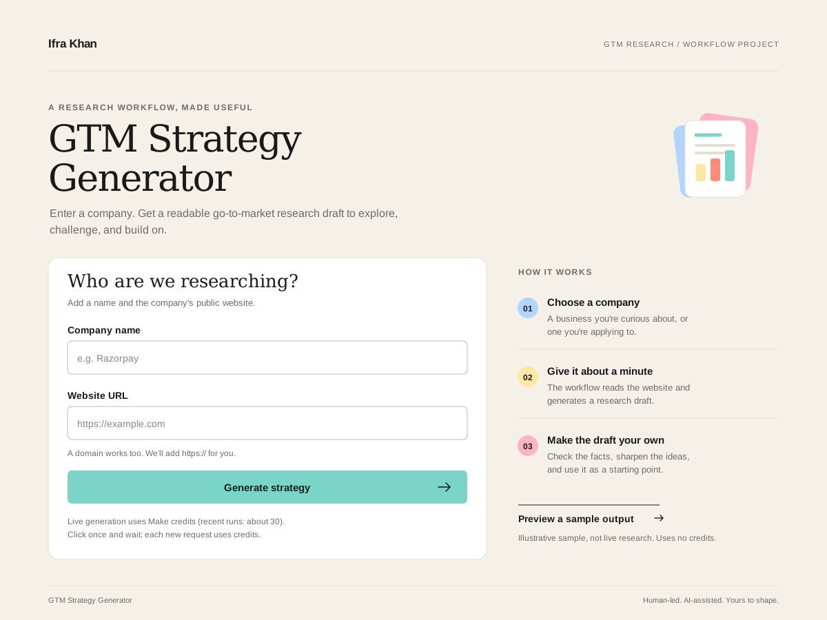
An AI-assisted GTM research tool that turns a company name + website into a structured go-to-market draft (ICP, positioning, channels). Built to speed up early product marketing research.
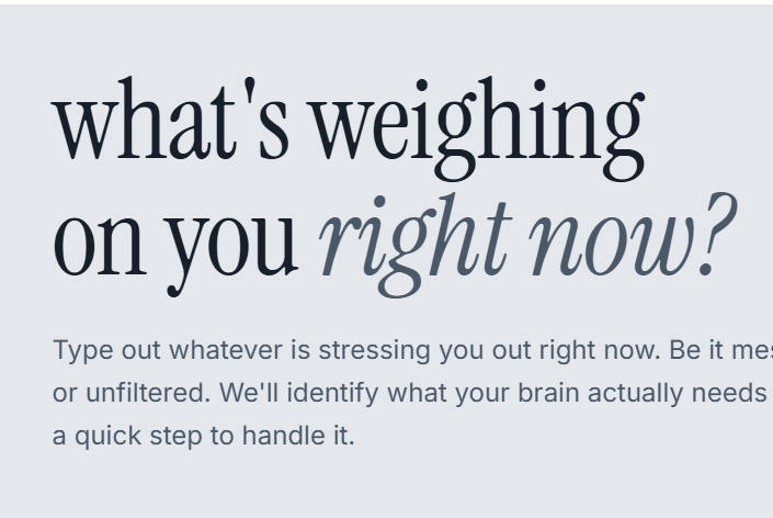
A psychology-first stress relief tool that turns vague stress into a targeted, mechanism-matched action.
I'm a generalist.
I don't like staying inside one box just because that's what the box says. I'm comfortable moving between people, data, research, strategy, and execution — whatever the problem needs.
I don't see "I don't know" as a dead end.
It's usually where I start.
I'll talk to users, dig through data, research behaviour, sketch a product, rethink the strategy, or learn something completely new when the problem calls for it.
I'd rather figure it out and build than wait until I have all the answers.
A brand and marketing audit focused on positioning, product strategy, distribution, storytelling, and growth opportunities for one of India's most distinctive coffee brands.
Sleepy Owl is an Indian coffee brand started by three friends who saw a gap: good quality coffee at home, made with as little effort as possible. The brand feels cheerful and approachable, speaking to young, ambitious people who want real coffee without the complicated ritual that specialty brands often push.
The owl mascot does much of the personality work. The language is simple and direct, and “It's That Good” is short, confident, and memorable. Instead of leaning on exclusivity or long tasting notes, Sleepy Owl treats coffee as part of everyday life.
A personality-led brand built around an owl mascot with a light, direct tone of voice.
Coffee as a natural part of daily life — not a ritual and not a lecture.
A confident tagline that is short, memorable, and honest without being pretentious.
The early focus was on people who were still figuring out coffee: make the first try easy, then grow loyalty as those customers start earning and exploring more brands.
The range has expanded carefully from packaged cold brew into adjacent everyday occasions:
Quick, mess-free cups with no equipment needed.
Grab-and-go convenience for on-the-move moments.
A refreshed format with a distinctive owl-shaped jar.
Protein coffee, plus RTD and ready-to-mix matcha formats for newer routines.
Pricing sits in the premium range. Ready formats and functional products sit higher because of convenience and added value, while bundles and promotions support trial without undercutting the positioning.
The D2C site works as a brand and storytelling space, while marketplaces, quick commerce, and offline retail drive planned and impulse purchase occasions.
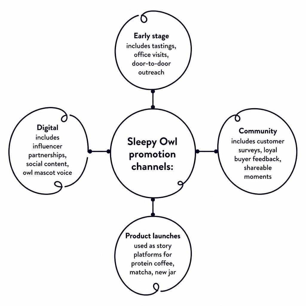
Early growth was hands-on: tastings, office visits, and door-to-door outreach. Today the work spans digital content, influencer partnerships, and community. Customer surveys and loyal-buyer feedback continue to inform the brand, while the owl keeps social content light and interactive.
The brand has stayed coherent: approachable quality, convenience without compromise, and a personality that feels human. Protein and matcha are strong moves. The storytelling around them can lean harder into the same “easy + actually good” language that built the core brand, so they do not feel like separate categories.
Show how different people fit Sleepy Owl into desk coffee, post-gym Profee, afternoon matcha, and late-night deadlines.
A clearer push for customer moments — with a simple hashtag and consistent featuring — would build living social proof.
Make ethical sourcing and thoughtful product decisions more visible without turning the brand into a lecture.
Short pieces about real product usage will land better than deep technical content.
Build recurring formats around everyday coffee occasions so the brand has a steady stream of usable, on-brand content.
Prioritise creators whose routines already intersect with the product: productivity, self-improvement, corporate, matcha, and functional-drink voices.
Give every new product a cultural or consumer story before the product announcement. Lead with the occasion or feeling, then introduce the product.
Quick commerce is one of the easiest and most prominent places people buy from, and one of the strongest places to test moment-based messaging. Focus on whichever platform currently drives the highest sales and run a focused pilot there.
Hustle, getting started, and the first coffee of the day.
A quick reset or focus boost in the middle of the day.
Winding down, catching up with friends, or easing into the evening.
The product stays the same. The story matches the moment a person is in when they open the app, keeping the brand relevant without heavy new production for every ad.
Hey there, I’m Ifra.
I’m a final-year Psychology student at Lady Shri Ram College for Women, with a minor in Computer Science. Ever since I was little, I knew I didn’t want to be boxed into just one thing. That curiosity has shaped everything I’ve done since.
I’m most interested in the intersections: psychology, technology, products, and business. My academic background has made me especially curious about human behaviour, decision-making, cognition, and how people actually interact with technology. Outside the classroom, I’ve explored this through product work, startup strategy, growth and marketing projects, research, and building things myself.
I'm particularly drawn to problems where understanding people is just as important as understanding the business or technology behind them.
I don’t have it all figured out (and I don’t think anyone does). What I do have is a different way of looking at problems, a willingness to experiment, and the ability to move between different kinds of work without losing the thread.
Sometimes it works, sometimes it doesn’t but I always learn something new. And that, to me, is what matters.
Outside of work, I live just as intentionally. I read (strictly fiction), keep my Letterboxd updated, make Spotify playlists for every possible mood (I currently have over 50), and watch Formula 1 even though it regularly stresses me out.
Feel free to send me a book or movie recommendation or ask for one. I have lists ready!
Took a pre-launch MVP from "idea with screens" to a launch-ready product in 8 weeks. Worked on everyting product: Design, strategy, user research & everything in between.
When I joined, VibeSquad existed as a set of Figma screens with no live users, no analytics, and an evolving product direction. Core flows had gaps, the pricing/earning model was confusing, and there was no defined path to launch.
VibeSquad is a social-commerce platform that connects socially active users with brands and helps them get paid for their social influence through social shopping and brand collabs. Users discover opportunities, participate in campaigns, purchase products, and earn rewards linked to their social influence.
When I joined, VibeSquad was an early-stage MVP preparing for launch. Some product concepts were still being defined, while others existed as incomplete or inconsistent flows. There were no live users or quantitative product data, and the product direction was still evolving.
With no dedicated senior PM, I operated with significant autonomy, working closely with the founder for direction and approval.
My role spanned product thinking, UX, and execution — including identifying friction and launch blockers, mapping and restructuring core user journeys, defining solutions and translating them into product flows, clarifying product communication around pricing and Social Score, writing product requirements, and contributing to growth strategy.
My involvement typically followed the full cycle: Identify → Define → Design → Communicate → Implement → Review. This taught me not only designing interfaces but determining what needed to be built and why.
| Constraint | How it shaped my approach |
|---|---|
| Pre-launch / no active users | Relied on qualitative research, usability testing, heuristic evaluation, product logic, and stakeholder feedback rather than quantitative behaviour data. |
| 8-week timeline | Prioritised high-impact journeys and launch-critical problems over lower-priority polish. |
| Evolving product direction | Designed flexible solutions and continuously re-evaluated decisions as the product proposition evolved. |
| Small team & engineering constraints | Balanced ideal UX solutions with what could realistically be implemented within available time and resources. |
| Limited analytics infrastructure | Focused on making the product launch-ready while identifying what would need to be measured and validated post-launch. |
Rather than treating these limitations as gaps, I treated them as characteristics of an early-stage product environment — and made it my immediate goal to reduce ambiguity, strengthen the core experience, and create a product that was ready to generate meaningful user feedback after launch.
With no live users or analytics, I relied on four complementary research methods to identify the specific gaps blocking launch. Each method surfaced different kinds of problems — and together they formed the backbone of my prioritisation for the entire internship.
Turning a static information display into a state-based experience that helps users understand where they are and what to do next.
Decoding a new social-commerce model so the price finally feels like a promise.
Reframing visibility and competition as an engine for return behaviour.
Because the product was pre-launch, I could not claim that these changes actually increased task completion or reduced support volume. These were hypotheses to be validated after launch — and here's how I'd do that.
Turning a static information display into a state-based experience that helps users understand where they are and what to do next.
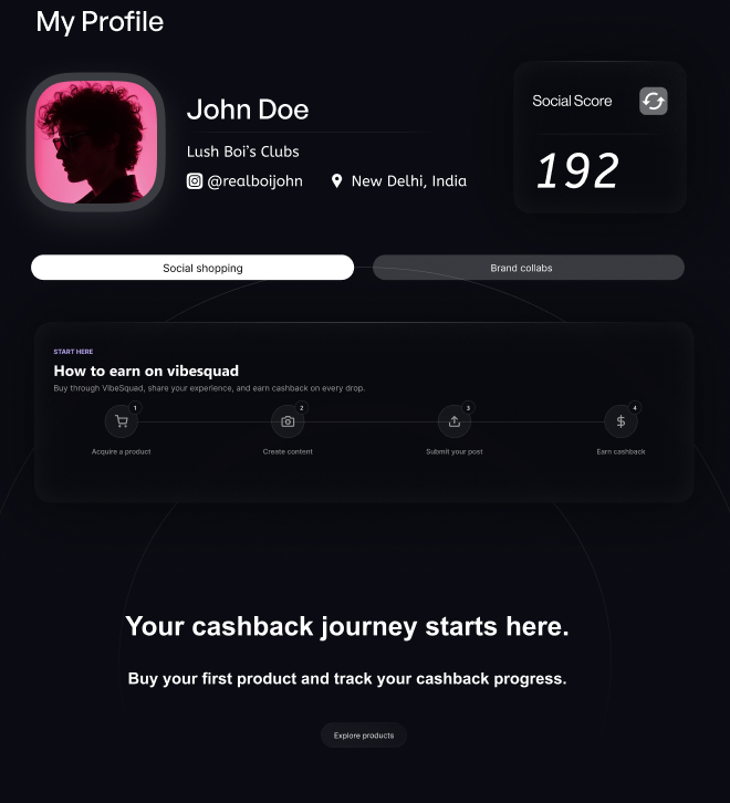
VibeSquad's core proposition is social commerce, but the existing Profile experience did not adequately support the journey that follows a purchase.
Users could not easily see their order history, current order status, progress toward earning, or what action they needed to take next.
Users could earn through multiple mechanisms — cashback, discounts, referrals — but there was no clear way to understand how much they had earned, where it came from, or when they would receive it.
The two experiences contained partial and overlapping information about orders, cashback and campaign activity, forcing users to piece together their overall activity themselves.
Plus: no first-time user guidance of how the VibeSquad earning journey worked or what they should do to get started.
The main information architecture decision was whether to separate order fulfilment information from the post-purchase earning journey. A conventional e-commerce approach would treat order number, shipping and delivery as one experience, while content submission, review and cashback would sit elsewhere.
However, for VibeSquad, these stages are inherently connected. The user's purchase is only the beginning of the journey; their subsequent actions determine whether and when they unlock their earnings.
I therefore also considered whether Profile and Earnings should remain separate destinations or be consolidated into a single experience.
The trade-off: completeness vs. cognitive load. Combining profile, orders, campaigns and earnings risked creating an information-heavy dashboard. I therefore prioritised information based on user state and immediate relevance, while keeping secondary information available without giving everything equal visual prominence.
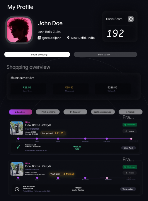
I created a central Shopping Overview that brings together orders, campaign activity, progress and earnings, giving users a consolidated view of their activity on VibeSquad.
I designed an empty state for first-time users that introduces the earning model and explains the shopping → participation → earning journey. This gives new users context before they have any transaction history and establishes an initial mental model of how the platform works.
I redesigned individual orders as state-based experiences rather than static transaction records. The cards communicate the user's current position in the journey, including order status, progression, cashback status and the next required action.
I integrated Earnings into the Profile experience, connecting a user's identity, activity, performance and financial outcomes rather than making them navigate between disconnected destinations.
The core shift was from a Profile that displayed information to a Profile that helped users understand and act on their current state. The redesign established a more unified mental model of the VibeSquad experience and it enabled greater self-service — particularly around questions such as "What is happening with my order?", "What do I need to do?", and "Where is my cashback?"
Because the product was pre-launch, I could not claim that these changes actually increased task completion or reduced support volume. These were hypotheses to be validated after launch through task completion, support-contact rate, journey drop-off and cashback-related behaviour.
Decoding a new social-commerce model so the price finally feels like a promise.
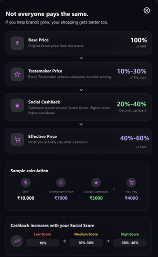
VibeSquad introduced a fundamentally different pricing and earning model from traditional e-commerce. A user's final economics were determined by multiple components: the product's MRP, a Tastemaker Price based on Social Score, Social Cashback earned through participation, and the resulting Effective Price.
The challenge was not simply displaying these values. Users needed to understand what each component meant, how they related to one another, what they would actually pay, and how they could earn money back through their participation.
This was particularly important because the model introduced a different purchase journey: Buy → Create → Share → Earn. Users were not only purchasing a product; they were also participating in a social-commerce loop that many would not be familiar with.
Why it mattered: If users cannot understand how much they pay or how much they can earn, the value proposition becomes difficult to trust. The experience therefore needed to answer two questions clearly: What will I pay? and How do I earn my cashback? — without overwhelming users with the underlying pricing logic.
I approached the problem as a progressive disclosure and product communication challenge: users needed the key financial information immediately, while the underlying pricing model could be explained separately when they wanted more context.
Initially, I considered a full pricing breakdown table with each term explained with its definition vs. a simplified 'you pay X, you earn Y' summary — but eventually settled upon these three levels of communication:
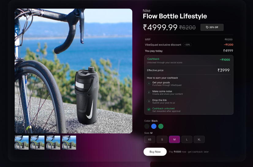
Show what the user pays and earns directly on the product page.
Bring relevant pricing information directly into the product experience so users don't have to leave the purchase journey.
A separate "How Pricing Works" experience for users who needed to understand the complete model.
This allowed the product to communicate the value proposition without forcing every user to understand the entire pricing mechanism before purchasing.
I also separated understanding the pricing model from understanding the purchase journey. Pricing required financial clarity, while Buy → Create → Share → Earn required behavioural guidance. Treating them as separate communication problems kept each interaction more focused.
I considered a guided step-by-step feature tour popup vs. a contextual tooltip approach — but chose the former because tooltips are very easy to dismiss or skip, while the tour allowed us to convey more information along with context in a better manner.
I designed a dedicated educational flow to explain the complete pricing model through a contextual example. Rather than presenting the pricing mechanism as a technical formula, the experience progressively introduced: Base Price → Tastemaker Price → Social Cashback → Effective Price.
I brought the relevant pricing information directly into the product experience so users did not have to leave the purchase journey to understand the economics of a specific product. This shifted the experience from explaining a generic pricing system to answering the user's immediate question: "What does this product actually cost me?"
The purchase experience itself was unfamiliar, so I introduced a contextual feature-tour modal when users first reached the product information page. The four-step explanation established the expected journey: Buy → Create → Share → Earn. This helped set expectations before the user committed to the purchase and made the additional participation required to unlock cashback explicit.
The resulting experience created three layers of product communication:
Reframing visibility and competition as an engine for return behaviour.
VibeSquad's existing leaderboard primarily answered one question: "Where do I rank?"
However, a ranking alone did not give users enough reason or direction to engage with it. The existing experience did not clearly communicate where a user stood relative to others, what they could unlock by improving their position, how they could climb, or what actions they should take next.
Why it mattered: A leaderboard creates motivation only when users can understand what their position means and believe that improving it is achievable. The experience needed to answer four questions: Where do I stand? What is my next milestone? How far am I from reaching it? What should I do to get there?
Without this information, the leaderboard risked becoming a passive ranking page rather than a mechanism that encouraged participation.
I reframed the leaderboard from a ranking interface into a progression system.
What I considered: Whether the leaderboard should primarily show rank or help users understand how to improve it. I also considered how to make progression and rewards feel connected rather than separate.
What I prioritized: Clarity and actionability: one immediate milestone, a clear explanation of the gap, and visibility into what users could do to progress.
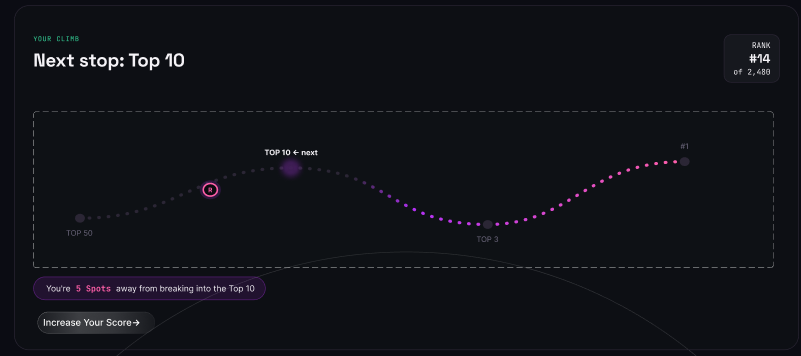
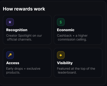
What I decided: I introduced a single dynamic milestone based on the user's current position (Top 10 → Top 3 → #1), translated ranking gaps into activity-based progress such as Purchase Impact points, and added a "How to Climb" / Game Plan to suggest actions. Rewards were incorporated into the progression system across Recognition, Economic value, Access, and Visibility.
Trade-offs considered: More information could make progression feel motivating, but too many goals and actions could create cognitive overload. I therefore prioritized one clear next milestone while keeping supporting actions and rewards secondary.
The redesigned experience surfaces the user's current position, next milestone and progression through a visual journey from Top 50 → Top 10 → Top 3 → #1. The user can immediately see where they stand and what they are working toward.
The "Where You Stand" section was redesigned to provide a single, dynamic next milestone instead of multiple competing goals. This turns the leaderboard from a static ranking into a personalised progress indicator.
Top performers receive dedicated visual prominence, making their status and achievements visible to the wider community. This serves two purposes: recognising high-performing Taste Makers and creating aspiration for others through social visibility.
The redesigned leaderboard makes the relationship between performance and rewards more visible. Instead of users seeing a rank without context, they can understand what higher positions can unlock and why improving their position matters.
The reward system was surfaced directly within the leaderboard experience, explaining the different types of rewards available and making the value of progression more tangible. The later framework also specified that reward visibility should be adaptive, showing rewards that are actually achievable rather than advertising unavailable rewards.
The resulting experience was designed around: Activity → Social Score / Progress → Leaderboard → Rewards → Visibility → More Activity. This connects the leaderboard back to VibeSquad's broader participation loop rather than treating it as an isolated screen.
The redesign transformed the leaderboard from primarily a ranking surface into a progression and motivation layer. It also gave users greater visibility about key things such as where they currently stand, what milestone they are working toward, how progression relates to their activity, what rewards are available, and what actions can help them progress.
An independent go-to-market strategy I developed for Mave Health’s neurotech wellness device focused on behavioural reality, category education, and trust-building.
Mave is positioned as a general wellness device, not an FDA-approved medical device. While this widens the audience, it also means marketing and evidence need to carry the full weight of education and trust that regulatory approval would otherwise lend. The narrative must stay honest about what the product can do today and what it can't — overclaiming in this category backfires hard.
Note: I had limited business context and all information used is based on secondary sources. Primary business context would shape the strategy differently.
| Reality | What it means for GTM |
|---|---|
| Problem self-awareness is incomplete | High-functioning people feel scattered attention, anxiety & fatigue but don't treat it as a problem needing a solution until it's acute. We have to surface the problem before we can sell the product. |
| Category education required | tDCS isn't a household term for lifestyle use. Every asset needs a simple mental model: what it is, why 20 minutes, why the prefrontal cortex, how it differs from meditation apps or stimulants. |
| Research gap for healthy users | Existing tDCS literature sits mostly in clinical populations. Claims about focus/mood for healthy users need their own real-world and academic data. |
| Evidence gap | No trials or publications on the effectiveness of the device itself yet. 4 observational studies (~200 participants) are under academic review — a genuine step forward, but not yet usable as a marketing claim. |
| High trust threshold | A $495 device that puts current on the head needs more credibility than a typical gadget purchase. Social proof, expert voices, and transparent science are essential. |
Mave's current marketing looks aimed at anyone who wants to improve their mental health, reduce stress, focus better. That's too broad. We need to be more precise in terms of target audience and ICP. Before going all-in on any channel or tactic, I'd run a validation sequence.
Draft a working persona — pain, desired outcome, and the language they actually use — then manually message 15–20 people who match it. The bar: whether they're describing this exact pain unprompted, in their own words, and would be genuinely disappointed if a solution like this didn't exist. If fewer than roughly a third of real conversations hit that bar, revise the hypothesis.
Product-market fit and product-channel fit are different things. A genuinely good fit for the persona can still die on the wrong channel. I'd take the validated ICP and test presence on 2–3 candidate channels like LinkedIn, Reddit, and similar in parallel, for 2–3 weeks each. A channel is validated once one specific, repeatable action on it reliably produces real ICP engagement consistently enough to justify betting the next stage of effort on it.
Once I have a validated channel, I'd run a build-measure-learn loop: 3–4 distinct messaging strategies on that single channel — problem-first, science-first, or social-proof-first — each for a defined period, measured against one metric (landing-page CTR, DM reply rate, signups). Pick the winner based on that metric, then scale.
Each serves a different job but together they form an all-round growth system that fits Mave's stage and category. Whichever one clears the validation bar becomes the primary focus.
Highest-leverage moves that build the foundation without needing large paid budgets:
Complete the manual conversation sprint, refine persona, and build channel & strategy around it and then scale.
Most effort should sit at awareness. Many people are not yet aware of their own cognitive-load struggles or of neurotech as a category. The job is to make them aware of the problem and of Mave by providing value, not by pushing a purchase yet.
Someone arriving from YouTube is in a different headspace than someone coming from a Reel or a Reddit comment. Document discovery → consideration → conversion for each major path, then fix the top 2–3 friction points per path.
Stand up a short-form + long-form content engine, a systematic repurposing workflow, and near-daily presence in priority communities under the 90/10 value rule.
Build a target list of relevant labs and researchers, craft a clear mutual-benefit offer, and start conversations. In parallel: support publication of the existing observational work and prepare a transparent public research page.
Modern stress rarely looks like a dramatic breakdown. More often it is quiet and constant: fifteen browser tabs, the guilt of the always-on commute, the invisible load of holding work, family, and self together. These pressures degrade focus, mood, and resilience long before people name them as "mental health problems." Mave is a 20-minute, science-rooted wearable reset designed for that reality. Not as a medical treatment, but as a modern tool for a modern load.
Primary: Build awareness and emotional recognition — make the audience feel seen in struggles they rarely show.
Secondary: Drive qualified exploration (site visit, waitlist, pre-order interest) by linking that recognition to a clear, credible next step.
Mave positioned as the modern solution for everyday cognitive and emotional load, not another meditation app, stimulant, or productivity hack.
High-functioning working professionals (roughly 28–45) who already care about performance and recovery, live in always-on environments, and feel scattered, depleted, or "on" even when they are off — but may not frame it as something that needs a tool. They are coping, not collapsing.
Go beyond generic "stress." Show specific, under-acknowledged moments of cognitive and emotional load:
Each frame should make the viewer think: That's basically me.
A psychology-first stress relief tool I built to turn vague stress into precise, mechanism-matched micro-interventions. It figures out what’s actually broken first & then delivers one targeted action.
The negativity bias that kept our ancestors alive now fires at traffic, deadlines, and unanswered emails with the same intensity it once reserved for predators. The result: everyday modern stress gets processed as threat, and without a healthy outlet, it compounds into anxiety, burnout, and worse.
The people most affected aren't the ones in clinical care. They're the workaholic pulling 60-hour weeks, the junior employee terrified of their next review, the senior leader who can't let anyone see them struggling. High-functioning, not diagnosed, and with neither the time nor the money for weekly therapy sessions.
They don't need clinical intervention. They need something that works in the moment — fast, credible, and frictionless enough to actually use.
Competitors and existing players cover parts of the problem, but none fill the core gap: real-time, input-driven, mechanism-matched intervention delivery for non-clinical daily stress.
Existing apps fail not because their content is bad — breathing exercises and gratitude journaling are genuinely evidence-based — but because they're administered blindly.
The same feeling can have entirely different roots. "I feel unmotivated" might mean lost momentum, low competence, or absent optimism. Each of those needs a different fix. Gratitude journaling won't help someone who's stuck because they've lost their sense of forward progress. A small wins exercise will. Prescribing the same intervention regardless of root cause is the core design failure of every app in this space.
The second insight: people under stress don't know what's wrong with them. They just know they feel bad. The tool, therefore, can't ask "what's your problem?" It has to infer the underlying psychological need from messy, vague input — and then explain the match in plain language so the user understands why they're being asked to do something before they do it.
People who would never describe themselves as struggling with mental health but are running on empty. People who want something that works in under 5 minutes and doesn't ask them to download their fourth wellness app.
It cannot and does not address trauma, personality patterns, or diagnosed conditions. It will not fix deep-rooted issues. It makes you feel better in the moment — specifically so you can get back to dealing with the actual problem, which you are entirely capable of handling.
No chat dependency. No clinical framing. No therapy-speak. Just a precise tool that meets you where you are.
The user writes anything. No prompts, no categories, no mood scales. Freeform. The bar to entry is as low as possible — because the user who needs this most is the one who won't fill out a form.
The AI reads three signals from the input: the situation described, the emotion language used, and what the user has already tried or how they're already coping. From these, it infers the underlying psychological deficit — for example, low positive affect, weak agency, negative self-perception, disconnection, or lost meaning.
Rather than jumping straight to an intervention, the system identifies which specific mechanism is broken and needs restoring. This is the layer that makes precision possible. The system follows a hard sequencing rule: Safety → Clarity → everything else. If someone's nervous system is dysregulated, no gratitude exercise will land. The AI detects this first and routes to grounding before anything else.
Once the mechanism is identified, the system selects from a library of 14 empirically validated micro-interventions — all drawn from published positive psychology and clinical research, none invented by the AI. The AI's role is translation, not creation. The intervention is always delivered with a plain-language explanation of why it was selected. Rationale drives compliance.
Double inhale, long exhale, activates parasympathetic nervous system. For panic, racing heart, high arousal. Based on Balban et al. (2023).
Affect labeling to reduce amygdala activation. For vague, unnamed distress. Based on Lieberman et al. (2007).
Three specific positive events recalled with detail. For flat mood, anhedonia. Seligman et al. (2005).
Identify and take one tiny controllable action. For stuck, helpless, paralyzed. Behavioral activation.
Write to yourself as you'd write to a friend. For harsh self-criticism, shame. Neff (2003).
Direct warm wishes toward one person. For loneliness, disconnection. Fredrickson et al. (2008).
Identify one value and one action aligned with it. For meaninglessness, going through the motions. Based on ACT (Hayes et al., 1999).
The research validates the mechanism, not the format. Gratitude journaling works because it redirects attentional resources toward positive stimuli — that holds whether you're writing in a notebook or typing into a chat. The active ingredient is preserved; the container is modernized.
The AI infers and matches. It does not invent interventions. This is a deliberate product constraint — every intervention has a research citation, and the system never generates novel therapeutic content. This protects users and keeps the tool credible.
The target user is stigma-averse. The language throughout avoids therapy-speak. "It sounds like your sense of control has taken a hit" is different from "you appear to be experiencing low self-efficacy." Same thing; one of them actually lands.
Many deficits overlap — low optimism and lost momentum might both apply simultaneously. The sequencing rules and gate hierarchy resolve this: lower gates take priority, and within a gate, the mechanism closest to the presenting language wins. One clean decision every time.
The current version: user inputs freeform text, the AI inference layer identifies the mechanism deficit, explains the match in plain language, and delivers one step-by-step micro-intervention. The intervention library has 14 items covering all 7 mechanisms. It also has session memory: It keeps a record of each session logged and over time gives more personalized results based on your history.
Current limitations: the inference layer handles clear inputs well but struggles with very minimal input (single words, one sentence). Routing edge cases between mechanisms 3 and 4 (mood vs. agency) need refinement. The session memory mechanism needs to be be improved to accurately refer to previous input in personalizing intervention delivery.
The first channel isn't an app store. It's LinkedIn and community Slack groups — specifically communities for people who'd rather optimize their performance than admit they're struggling. That framing (optimize, not cope) is the positioning that gets past the stigma wall with the target user.
Not downloads, not sign-ups. First completed intervention. That's the moment the product delivers value. Everything before it is overhead.
Does the mechanism explanation increase completion rate versus delivering the intervention cold? My hypothesis is yes — rationale drives compliance — but it needs to be validated.
Pattern detection across sessions. Right now every session is stateless. The real value comes when the system can say: "You've been hitting the agency mechanism three times this week — that's a pattern worth looking at." That moves it from reactive to genuinely insightful without crossing into therapy territory.